03 Dashboards
Project dashboard
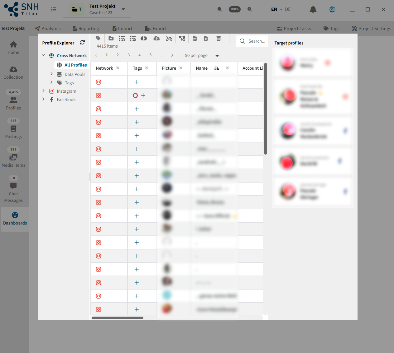
In each project, you will find a dashboard under "Home" that contains the following elements:

| A | For each object type you can see here the total number of objects saved in this project, e.g. profiles, postings, media and chat messages. |
| B | You will get a list of all target profiles in the project. By clicking on the target profile you will get more detailed information in the C and D section. |
| C | Here you can preview the saved postings of the target profile. The newest 5 postings are always displayed. |
| D | Here you will get a preview of the friends, with only the first 5 displayed. |
| E | By clicking the "Refresh" button above the postings, you can update the profile data with one click. For this, a new survey request is sent to the runners and processed. This "Refresh" button collects the latest posts, as well as the latest profile data, such as username and network ID. |
| F | By clicking on the "Refresh" button above the friends, you can survey the friends list again. A new survey request will be sent to the runners for this as well. |
| G | The Dashboard button takes you directly to the Dashboard page for the selected target profile. More about this in the following sections. You can find the Dashboard button in many places in the software. It always redirects you to the Dashboard page. |
Profile dashboard
The profile dashboard is used to obtain as much information about a profile as possible at a glance.
You can access this page either by using the dashboard buttons, which are located in various places throughout the software, or by manually clicking on the Dashboards menu item. If you have chosen the latter way, you will initially be asked to select a profile.
Selecting a profile
When you select a profile, a popup appears.
 | There you can see your target profiles on the right side, which you can select directly with one click. If you are looking for a specific profile, you can do this via the table view on the left side. Here you have access to all filter functions that you also have in the data explorer. Click on a profile to select it for the dashboard. At this point we would also like to briefly point out that you can also simply double-click on a profile in the profile data explorer itself to go directly to its dashboard. |
Key figures
First, the software presents some key figures about the surveyed user. This includes the following information:
- Postings
- Comments
- Chat messages
- Media items
- Albums
- Reactions
- Friends
- Followers
- Groups

It is important to mention that the numbers shown here are not necessarily the actual amount of content generated by the user. Thus, 100 saved comments does not automatically mean that the user has written 100 comments in total. It only means that in the backups you triggered, 100 comments were found that were written by the selected profile. Similarly, if a timeline backup request was never sent for a profile, for example, a 0 is displayed at this point, even if the profile may have made a posting.
Monthly activity

In the monthly statistics you can see in a bar chart the number of found content generated by the user over the months of the last years. The statistics always start with the first generated content (comment, media, posting or chat message). Reactions are not included in the calculation, as it is not possible to clearly define at which point in time a reaction was made. It could be, for example, that a user only submitted a reaction years after the original publication of a posting. Taking the time of posting as the time of reaction could therefore distort the picture.
Furthermore, it is important to mention that especially on Facebook the birthday is declared as a single posting on some profiles. Thus, the time span can also go many decades into the past.
Annual activity
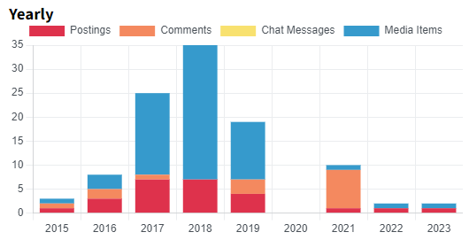
The annual activity statistics aggregate the monthly activity shown above to years.
Activity by day of the week
This statistic gives you insights into activity over the years aggregated to the days of the week. This can help to better understand the usage behavior of the target profile.
Activity by hours

This statistic shows the activity by the user of the social network throughout the day. Here, the activity is aggregated by time of day on an hourly basis across the entire dataset.
Users with the most connections
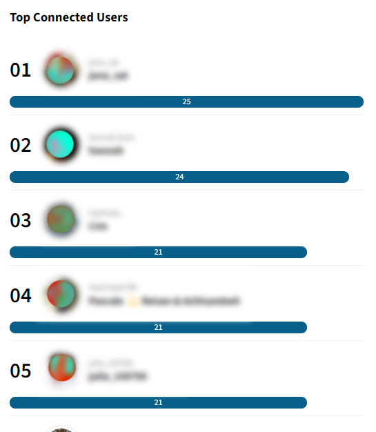 | This statistic clearly shows which users have the most connections with the target person. In contrast to SNH 1, not only is it taken into account whether a user is connected to another user via a reaction, for example, but also how often. A connected profile with 17 reactions to the target profile's posts is thus rated higher than a profile with 5 reactions, 5 comments and one friendship. |
Posts with the most interactions
 | This overview lists the 10 posts with the most interactions. Comments and reactions are weighted equally. By clicking on the |